
Direct-to-Consumer
Experiences
Getting someone to click an ad is the easy part. What happens next — the product page they land on, the navigation they encounter, the cart they almost complete — is where most ecommerce brands lose the sale. Across a series of direct-to-consumer engagements spanning wellness, fitness, outdoor, and specialty retail, we identified the friction points that were consistently breaking conversion and built the UX that removed them.
Tools Used
Scope of Work


K+
monthly active users across platforms.
%
Avg. improvement in conversion across redesigned flows.

Brands serviced
Reduction in drop-offs in checkout and plan selection.
From the Ad to the Product Page
When a paid ad sets a specific expectation — a product, a promise, a price — and the landing page doesn't immediately deliver on it, the customer leaves. We designed PDP experiences that picked up exactly where the ad left off: matching the visual language, reinforcing the value proposition, and removing every reason to second-guess the click.
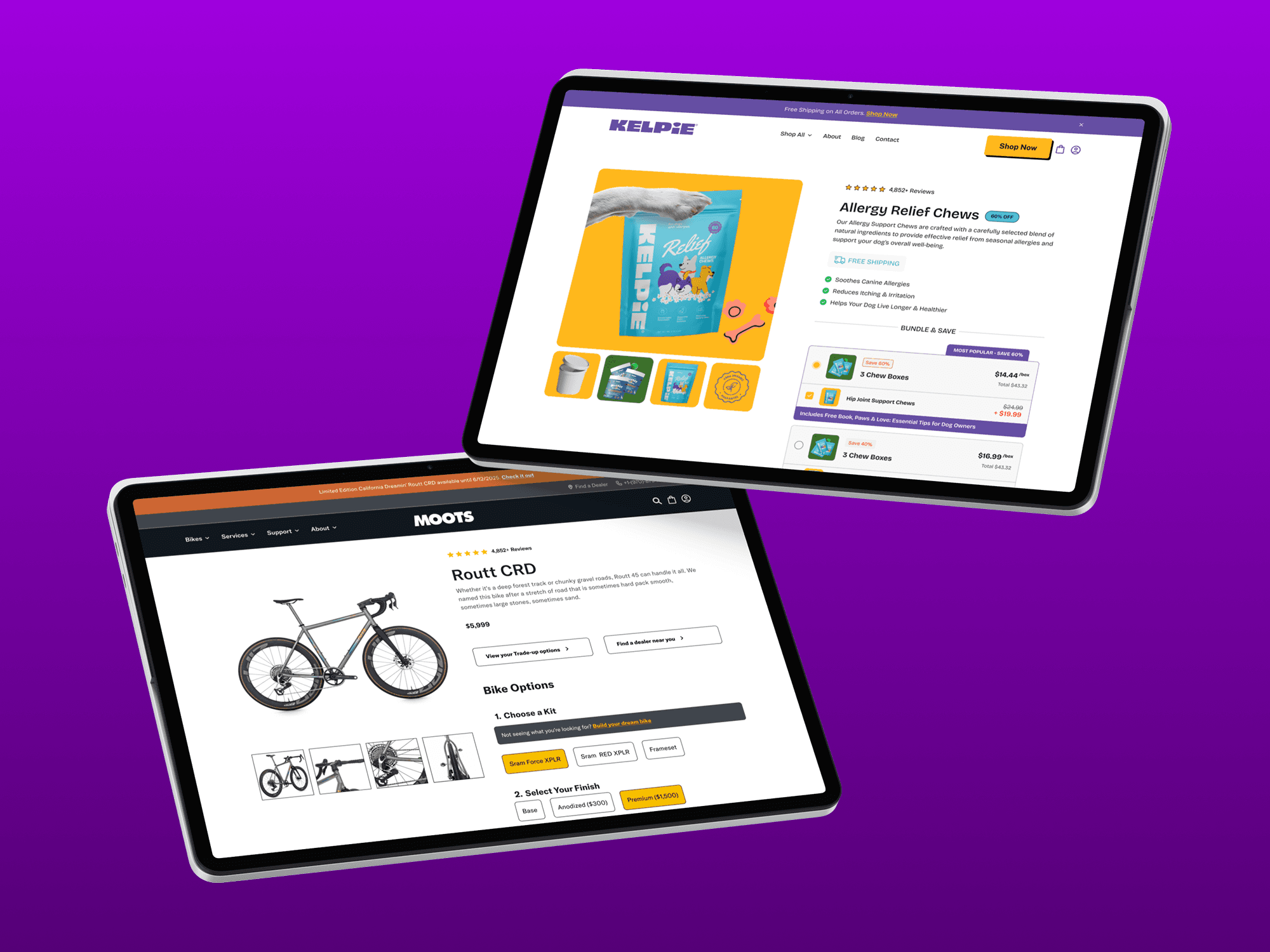
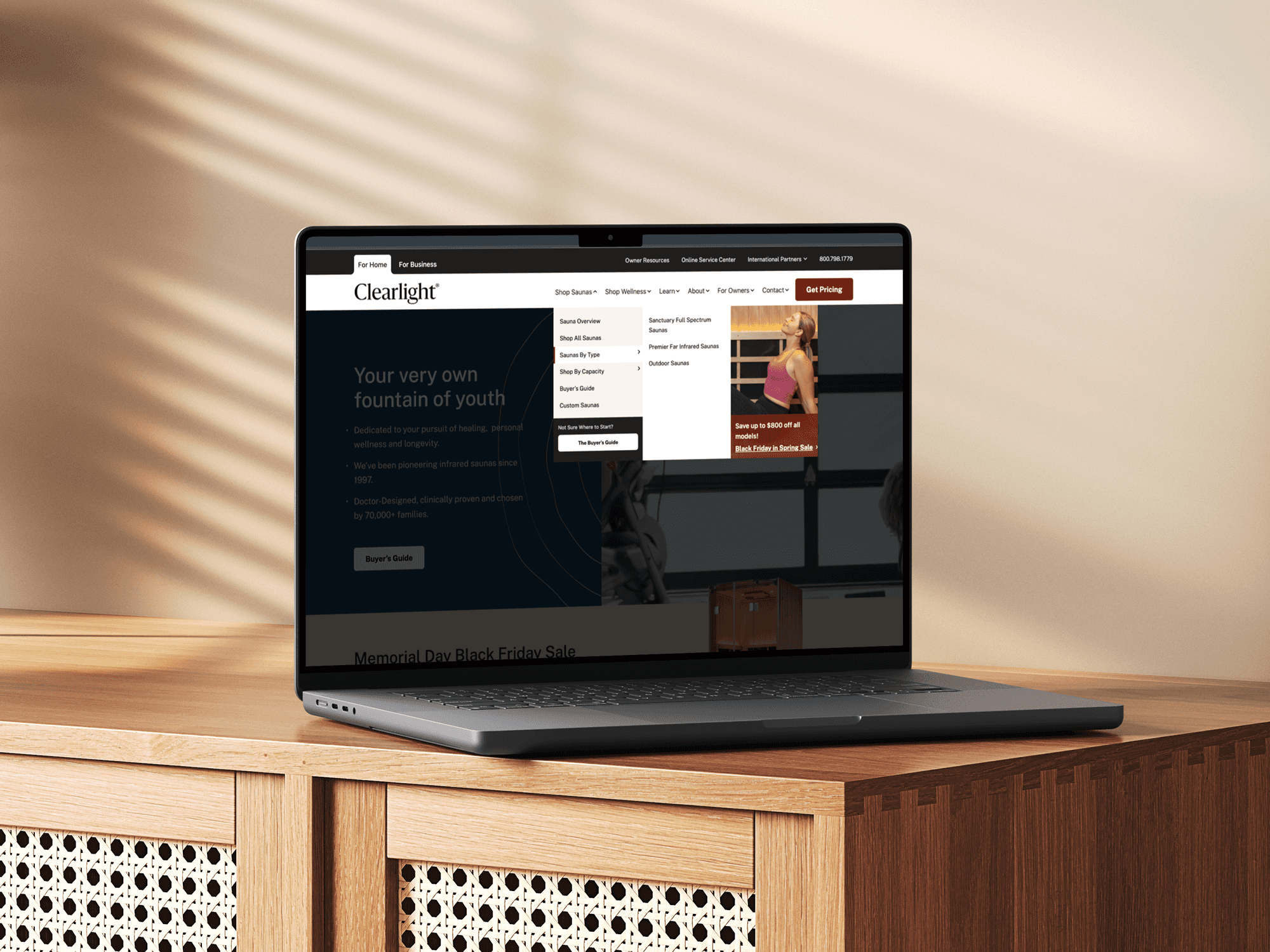
Navigation That Moves Shoppers Forward
A menu that tries to surface every category at once ends up burying the ones that matter. We restructured navigation systems to reflect how shoppers actually browse — by intent, by need, by the question they're trying to answer — rather than by how the product team organized the catalog. Fewer layers, smarter groupings, and clear visual hierarchy that moves a visitor forward instead of asking them to figure things out.
Filtering That Finds the
Right Product Fast
In collections with high SKU density, poor filtering doesn't just slow discovery — it kills it. Shoppers who can't narrow down to what they actually need within a few interactions don't keep trying. We redesigned collection page filtering with real browsing behavior as the brief: attribute-first logic, persistent filter states, and result counts that update in real time — so the right product surfaces quickly, from any starting point.

A Cart Experience That
Earns the Checkout
Most cart pages are a dead end — a list of items and a button. We treated the cart as an active conversion surface. For products with high consideration and meaningful price points, the cart needed to do more than summarize: it needed to reinforce the decision, surface trust signals at the right moment, and make the path to checkout feel like a natural next step rather than a commitment.

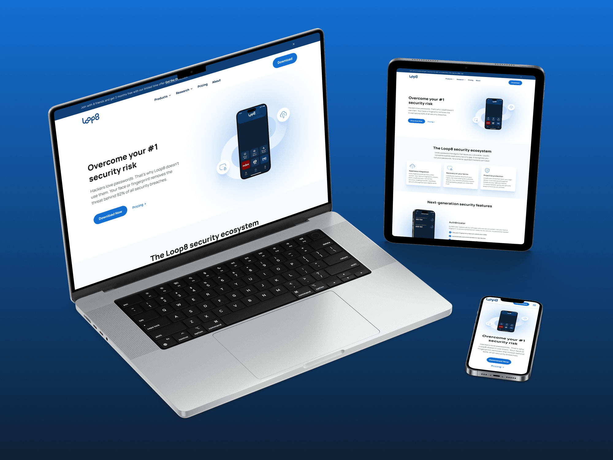
Responsive Design
This is not a feature, it is a basic requirement. If your site doesn't render well on a particular screen, you lose that share of customers, so we ensure that your design not just renders well but is optimized for users to go all the way through the funnel whether it's on mobile, desktop, or tablet.
Building the path of least resistance
for a considered purchase flow
Subscription models were structured to feel flexible and transparent. We focused on making plan selection, upgrades, and cancellations easy to understand and manage.

Lifecycle Email That
Moves People, Not Just Inboxes

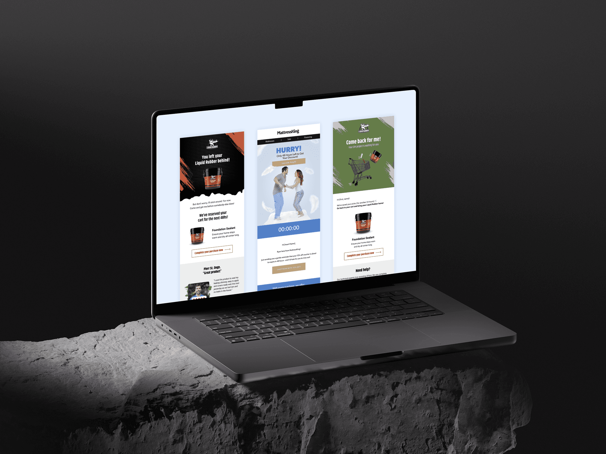
Triggered Communication
at the Moment It Counts
We've designed assets for email and messaging flows that reached customers at the exact moment re-engagement was most likely: not just timed sequences, but behaviorally activated touchpoints. Incentives were introduced strategically — not as a first resort, but as a well-timed nudge when intent signals warranted it. The result was communication that felt relevant rather than automated.